

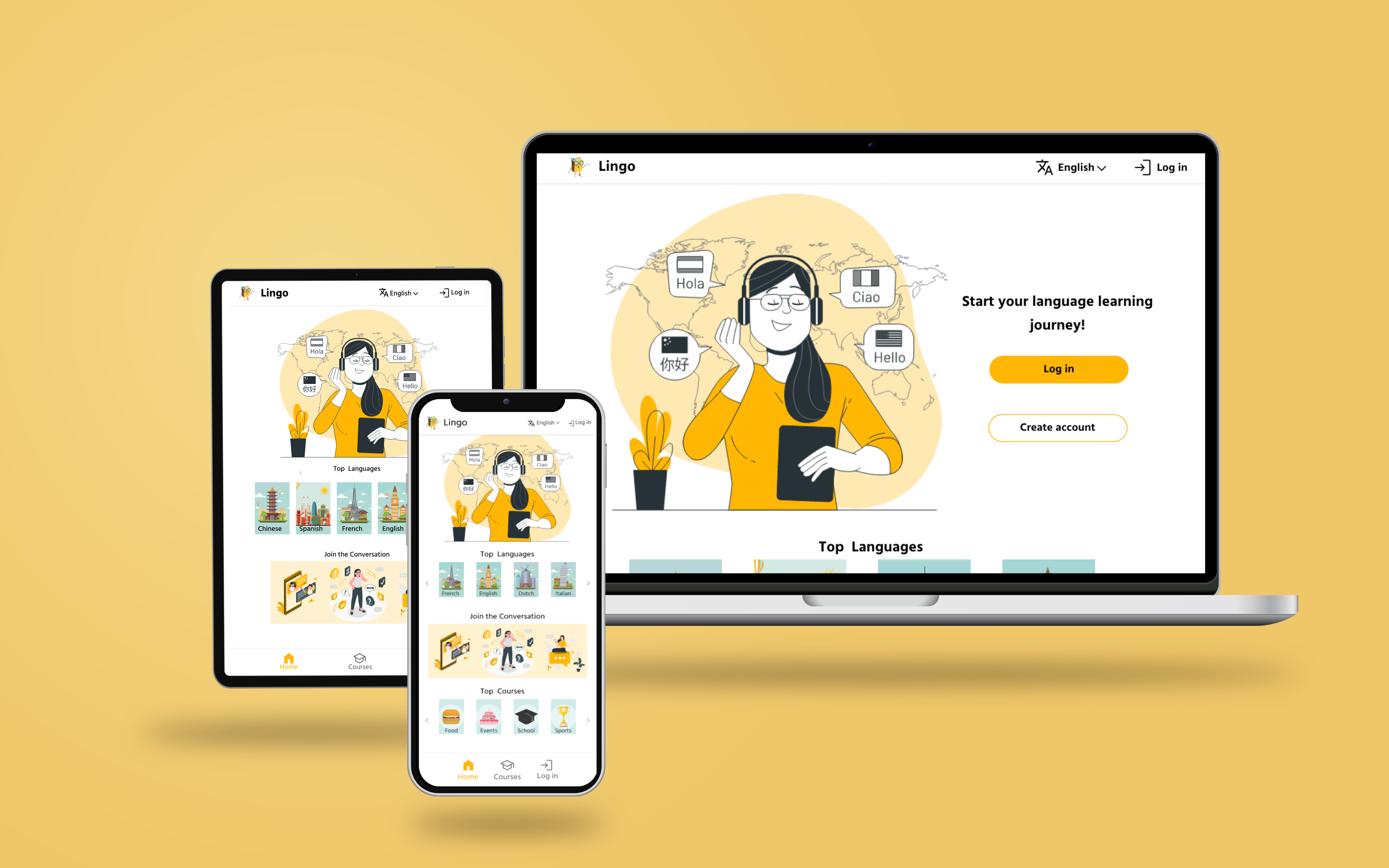
Lingo is a responsive web app located in the U.S. Lingo strives to provide an accessible and easy experience for users to learn how to read in a new language. It offers a wide range of languages as well as the ability to study words via index cards. Lingo targets users who need to learn to read in another language for survival or travel enthusiast.


I conducted interviews and created empathy maps to understand the users I’m designing for and their needs. A primary user group identified through research was working adults who need or want to learn to read in a second language online. This user group brought to light a need for accessibility specifically when it came to language barriers. Research also revealed that accessibility was not the only factor limiting users from learning another language. Other user problems include time, obligations, or access to devices that make it difficult to learn languages online.

Time: Working adults are to busy to sit at a desk and only use a desktop version.

Technology: Most apps are not progressive or do not work on all devices.

Accessibility: Some apps do not accommodate people with language and economic barriers.
.jpg)
Mapping Monica’s user journey revealed how helpful it would be for users to have the ability to learn a second language online via mobile or desktop. To also with the ability to review and study different sections.

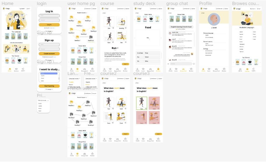
Taking the time to draft iterations of each screen of the website on paper ensured that the elements that made it to digital wireframes would be well-suited to address user pain points. For the user home page, I prioritized a simple and easy map-like navigation that divides the courses into categories to help users progress through the course.

As the initial design phase continued, I made sure to base screen designs on feedback and findings from the user research.

Easily create an account or log in. This was a key user need to address in the designs.

[video or me going through prototype]
I conducted two rounds of usability studies. Findings from the first study helped guide the designs from wireframes to mockups. The second study used a high-fidelity prototype and revealed aspects of the mockups needed refining.
Round 1 findings:
Round 2 findings:


The final high-fidelity presented cleaner user flows for learning, studying, and messaging in group chats. It also meets user needs for going back to the user home page, audio for new words, and online users count in group chats.
The user has the ability to click or navigate through the courses.
The website has high-contrast colors that make it easier to see text and icons.
The font is in the Serif family which makes it easier to read on a screen.
Impact:
The progressive web app makes users feel more confident in their ability to learn to read in a different language. It also gives users the power practice communicating with others in group chats.
One quote from peer feedback:
“It is nice to have the ability to review words, sometimes I don't have time for long lessons.”
What I learned:
While designing the Lingo app, I learned that sometimes adding little aspects of design can make a big impact on user flow. Usability studies and peer feedback influenced each iteration of the website’s designs.
Conduct another round of usability studies to validate whether the pain points users experienced have been effectively addressed.
Conduct more user research to determine any new areas of need.
Conduct more research to determine the most effective and efficient ways people learn.
Interested in collaborating or hiring me for UX design and research? Reach out using the form below and let's bring your ideas to life!

