

Florist is a online flower shop located in the Midwest. Florist strives to provide a unique and easy experience for flower lovers around the U.S. They offer a wide range of pre-designed arrangements as well as the ability to customize arrangements. Florist targets customers who prefer to shop online and would like to preview customized bouquets.


I created personas, conducted interviews, and created empathy maps to understand the users I’m designing for and their needs. A primary user group identified through research was young adults who prefer or require ordering floral arrangements online. This user group brought to light a need for accessibility. Research also revealed that accessibility was not the only factor limiting users from purchasing arrangements. Other user problems include distance from florist that make it difficult to purchase arrangements in-store, and time.

Uncertainty: People don’t always know what arrangements will actually look like. They only see after a purchase on an app.

Time: Working adults are too busy to stop into a floral shop during open hours. They also don’t have the time to pic arrangements in-store.

Lack of creativity: Most floral apps do not allow the user to design their own arrangements and preview them.

Accessibility: Some shops can’t accommodate people with physical or psychological needs.
.jpg)
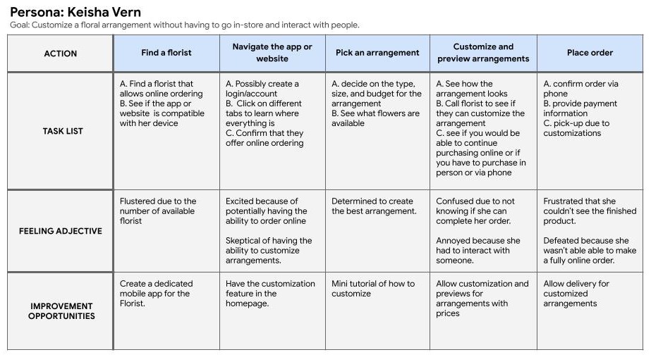
Mapping Keisha’s user journey revealed how helpful it would be for users to have the ability to customize and preview floral arrangements.
Taking the time to draft iterations of each screen of the app on paper ensured that the elements that made it to digital wireframes would be well-suited to address user pain points. For the customization screen, I prioritized a simple and easy adding and removing process to help users customize arrangements. As well as a preview page to help users see their final product.

As the initial design phase continued, I made sure to base screen designs on feedback and findings from the user research.

Easily previewing arrangements was a key user need to address in the designs.

[video or me going through prototype]
I conducted two rounds of usability studies. Findings from the first study helped guide the designs from wireframes to mockups. The second study used a high-fidelity prototype and revealed aspects of the mockups needed refining.
Round 1 findings:
Round 2 findings:


The final high-fidelity presented cleaner user flows for customizing, choosing, and previewing a floral arrangement. It also meets user needs for browsing and adjusting quantities.
The app has a simplistic color palette with high-contrast colors that make it easier to see text and icons.
The user has the ability to click or type in the number of flowers for customization.
The font is in the Serif family which makes it easier to read on a screen.
Impact:
The app makes users feel more confident in their online order of arrangements. It also gives users the power to customize and create their unique arrangements.
One quote from peer feedback:
“Being able to see what I built with the preview functionality makes me feel more comfortable purchasing online.”
What I learned:
While designing the Florist app, I learned that having simplistic designs for apps that will have many images makes it easier for users to follow the user path and streamline user flow. Having usability studies and peer feedback influenced each iteration of the app’s designs helps to keep the app about the user.
Conduct another round of usability studies to validate whether the pain points users experienced have been effectively addressed.
Conduct more user research to determine any new areas of need.
Interested in collaborating or hiring me for UX design and research? Reach out using the form below and let's bring your ideas to life!

